There have been so many amazing updates in Causal Map this past month! The ability to collaborate has been added, there is a new dashboard and a new reports tab. However, hands-down my favourite feature to use has been smart-zooming! It has been such a useful function when presenting my findings.
I always use hierarchical coding when coding as it gives me the option of presenting the larger overview or the finer details. It lets me create labels like Increased knowledge; Farming method/ practice which can also be grouped together with other factors like Increased knowledge; Markets and displayed just as Increased knowledge when “zooming out”.
However, until smart-zooming came along this was presenting some difficult decisions when creating my maps.
Zooming out to show the larger picture is appropriate for overview maps and is a great way to show my audience the big stories of change. However, when looking in more detail about specific drivers of change this sometimes led to over-simplifying my maps. Especially in cases when although the parent-factor was the same, some of the lower-level factors were really important (and frequently mentioned) in their own right and it seemed misleading to roll them all up together.
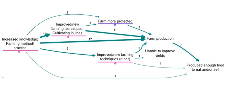
Before the smart-zooming feature, leaving them ‘zoomed in’ was the only other option and this sometimes led to displaying too much detail. For example, in the map above I want to keep my audiences focus on how the improved/new farming techniques led to increased farm production, so details such as whether the farm was more protected from animals or wildfire is unnecessary and distracting from the main story.
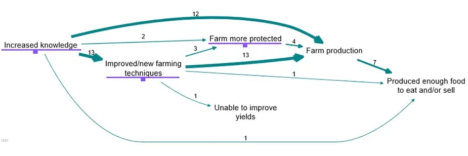
Here is that same map zoomed out to level one, the underlined factor labels are the factors that have been ‘rolled up’. It is easier to read but I have lost a lot of the detail, such as what type of knowledge drove these changes.
Enter smart-zooming! With smart-zooming I can enter a source count (number of sources who mentioned a particular link) and any link with a count lower than that number gets rolled up, whilst the rest are preserved.
In the map above the factor labels underline in purple have been rolled up and those underlined in pink have been preserved. I am able to present the main stories of change without distracting people with the links with small counts. In the above map I have set this number to 10, which is the default. As you can see I still have all the detail I wanted to present, such as the type of knowledge respondents had gained but none of the distracting little links. Lower level factors ‘use of fertiliser’ and ‘use of water pump’ have been rolled up into ‘Improved/new farming techniques (other)’ so it is clear there is variety within this factor but the unnecessary detail is not displayed as less than 10 sources mentioned each link.
If I had simply zoomed out, my audience would have not known that cultivating in lines was the most common improved/new farming techniques driving change. Using smart-zooming I can clearly present the most important stories of change.1`
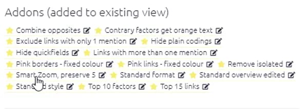
Find the smart-zooming filter in the add-ons section in the dashboard. Give it a go and let us know in the comments below how it helps you out!
Over the last three years we have developed a whole range of algorithms for causal mapping. The algorithms are published open-source in the form of functions for the programming language R.
I've got a load of texts to analyse, can I use Causal Map just for standard Qualitative Data Analysis, like ordinary thematic analysis, to identify important themes?